Last Friday was the close of the first quarter of school and the students just picked up their report cards and exited the building. Lots of top marks in the art department! Here's a sampling of what was learned:
Art, Design and New Media:
Art, Design and New Media:
| Student's advanced so quickly once they got the hang of using the pen-tool in Adobe Illustrator. They went from making basic shapes to silhouettes to complete self-portraits (like Grace's on the right). If you click on the image you can see all of the others. 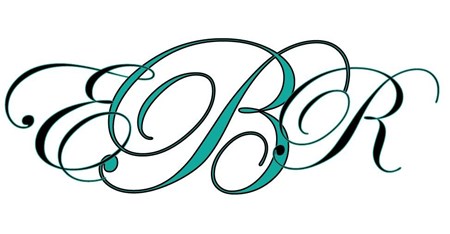 Emily's interlaced monogram Then we spent some time learning about type and fonts. Students now know what serifs are and how not to combine too many different fonts in one piece (unless a ransom-note is what you are going for...). We learned that there are actual designers that create (and own) each type-face. We know how to download fonts and when they are free and when one would have to buy a license. And finally, we change type from in-line text to graphic objects! Everyone made their own monogram, logo or glyph (like Emily's above). | 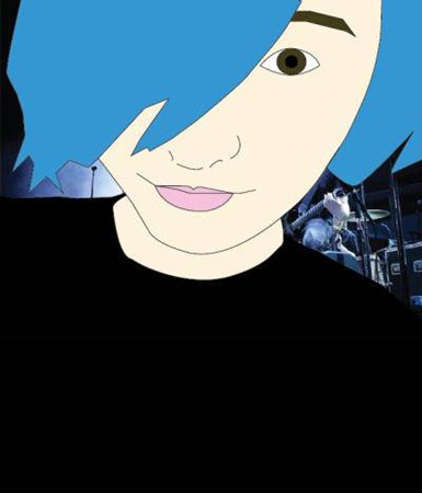 Grace's self-portrait in Adobe Illustrator This week ended with the students being able to flex all of their Adobe Illustrator skills using a rule of thirds grid to design a postcard (a few are already uploaded and you can see them on Artsonia). |
Fundamental of Studio Art 1:
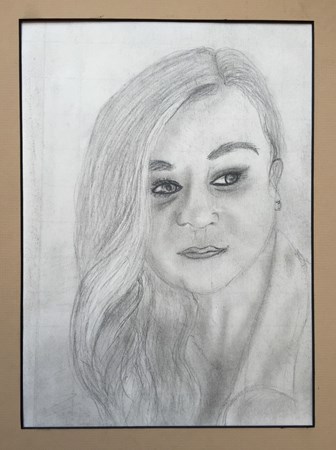
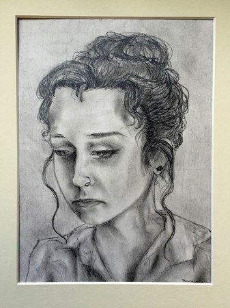
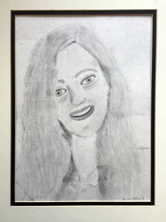
This intrepid group of art explorers took a detour to create some fun Dia de los Muertos masks.We returned to Betty Edwards this week, however, and and had lots of success drawing portraits with graphite using a grid. I've included the three that are completed below - this class is always game, excited to make an effort and I think it really shows. I look forward Linoleum block printing which we're beginning next week! Check out this great resource I discovered from Khan Academy on printmaking.
This intrepid group of art explorers took a detour to create some fun Dia de los Muertos masks.We returned to Betty Edwards this week, however, and and had lots of success drawing portraits with graphite using a grid. I've included the three that are completed below - this class is always game, excited to make an effort and I think it really shows. I look forward Linoleum block printing which we're beginning next week! Check out this great resource I discovered from Khan Academy on printmaking.
AP Studio Art/Art II & III
It can be a little complicated having three different levels in one class together but I think we are making it work. The AP students need to work increasingly more intensely as they converge or begin circling around a concentration idea to develop over the next several months. But ALL the students in this class work on similar themes or with similar materials as I encourage "artistic behaviors" rather than artistic products. Last week was time for a re-set - some students were "full steam ahead" while others need direction and instruction. The entire group worked on a straight-up graphic assignment this week - creating 4 - 4.5 x 6" letters of the alphabet, with the image of a word that begins with that letter (A - Apple...). The focus was the design concepts of space (positive/negative) and economy. I am so excited by what they had completed on Friday and will post the completed letters next week.
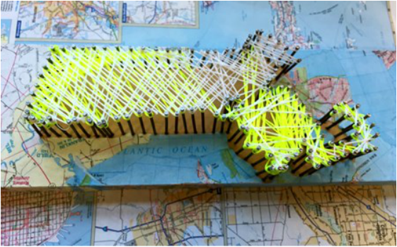
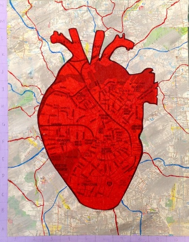
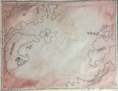
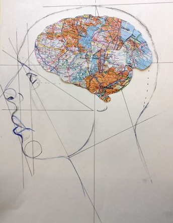
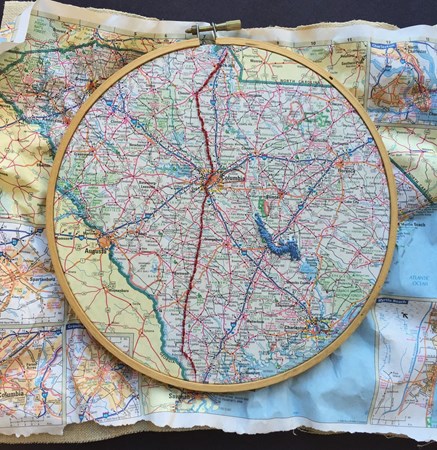
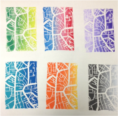
This is a gallery of recent work with inspiration from Maps and the idea of Place as a theme..
It can be a little complicated having three different levels in one class together but I think we are making it work. The AP students need to work increasingly more intensely as they converge or begin circling around a concentration idea to develop over the next several months. But ALL the students in this class work on similar themes or with similar materials as I encourage "artistic behaviors" rather than artistic products. Last week was time for a re-set - some students were "full steam ahead" while others need direction and instruction. The entire group worked on a straight-up graphic assignment this week - creating 4 - 4.5 x 6" letters of the alphabet, with the image of a word that begins with that letter (A - Apple...). The focus was the design concepts of space (positive/negative) and economy. I am so excited by what they had completed on Friday and will post the completed letters next week.
This is a gallery of recent work with inspiration from Maps and the idea of Place as a theme..


| Digital Photography/Advance Computer Art - We marked the beginning of Q2 with an assignment that combined both digital and analog processes - the paper lantern/light modulation project. To the left are a few photos from Kelly's blog. I hadn't considered this project for a few years and am really pleased I revived it. As a colleague commented to me, using both digital and manual skills "activates quite a few creative toggles." And the results are impressive! Next week we begin our "Selfie Project" and a few students have already begun gathering images. | |
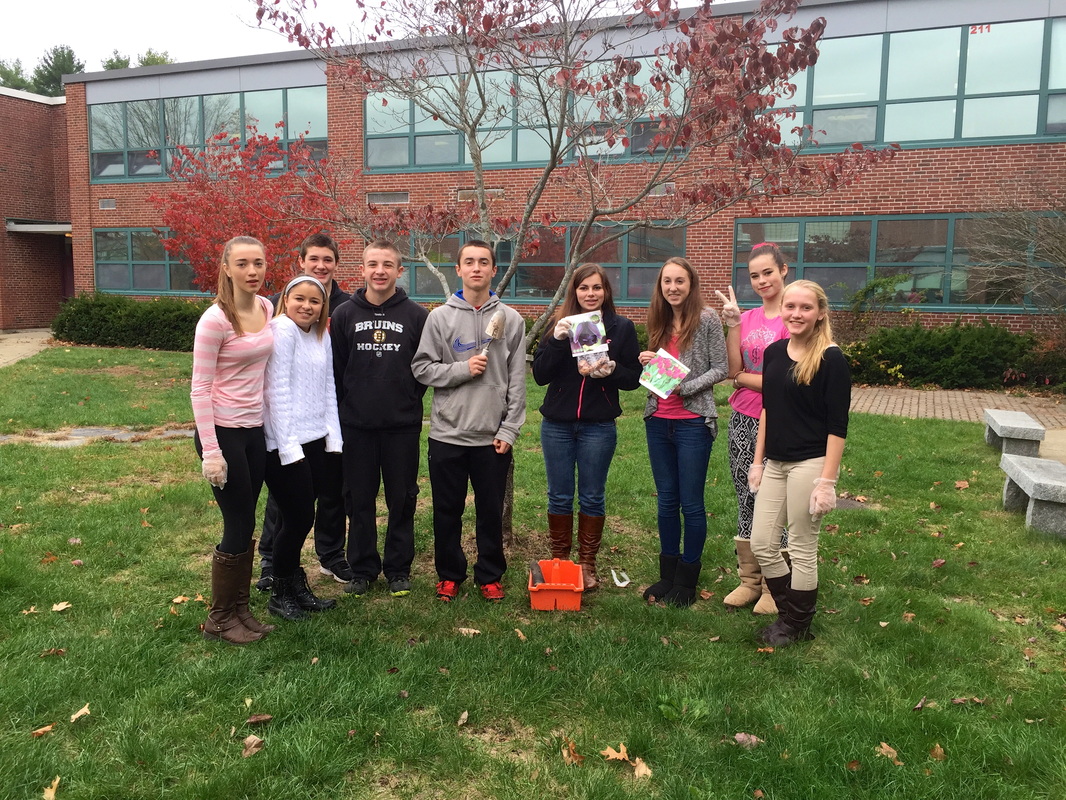 | Advisory - This is my new Freshman advisory! We implemented a school-wide advisory program 2 years ago and my group of Seniors graduated in May. This new crop and I will meet every other week for their entire high school career. It's a way for students and faculty to have a connection outside of the regular classroom. We cover all sorts of topics (recent discussions included bullying, and the Metrowest Health Survey). This photo is from Thursday - where we just beat the rain and planted a few dozen bulbs in the school courtyard. Our own mini school beautification project! |
 RSS Feed
